Which Way?: The Power of Wayfinding
By Kaylee Moon, Senior Planner

A schematic map of Fulton Center, the busiest subway station in Lower Manhattan. Credit: Candy Chan, Project Subway NYC
Fulton Center is the busiest subway station in Lower Manhattan. Even as a transportation professional who has lived in the neighborhood for years, I still don’t have every twist and turn of this multi-level complex memorized. For me, along with thousands of other daily users, the wayfinding elements of the center are essential to getting around. Wayfinding allows users to spatially-orient themselves and navigate to destinations. It encompasses everything that can help people find their way, from printed and digital signage to maps, markers to tactile and audio elements. It can be found anywhere: on the streets, inside venues or buildings, around subway stations, airports, and public places and it is essential to the customer experience.
Having worked on major projects in New York City and at airports around the country, I’ve come to appreciate the power of wayfinding to allow for more comfortable and efficient journeys. This starts with considering everyone who may use the system: users of all ages and abilities, with varying levels of internet access, fluency in English, and literacy, who may be accompanying others, carrying bags, or pushing a stroller. Although wayfinding alone cannot address all accessibility and equity concerns, it is a key tool in making transportation systems, facilities, and public space work better for all.
How can design ensure all users can get from point A to B efficiently, without feeling anxious or lost? In my experience, successful wayfinding consists of:
Design features: Consistent, Clean, Concise, and Clear
Context: Thoughtfully selected points of interest
Locations: Strategic spacing
1. Design features: Consistent, Clean, Concise, and Clear
We are familiar with the phrase, “less is more,” and I believe the same applies to wayfinding design. There are 4 C's to intuitive wayfinding.
Consistent: It may be thrilling to use many different colors, fonts, and textures, but having consistent design on all fronts instills trust in the wayfinding system, giving users more confidence in their journey. The best wayfinding systems are often supported by a thorough branding manual.

A WalkNYC wayfinding map.
Two notable wayfinding examples are the NYCTA Graphics Standards Manual from the Metropolitan Transportation Authority (MTA) and the NYC Department of Transportation (NYC DOT) WalkNYC program.
MTA’s branding hasn’t drastically changed from Massimo Vignelli and Bob Noorda’s original design in 1972. One can recognize the bold and simple branding from afar; it remains beloved.
NYC DOT’s WalkNYC is the City’s collection of maps and signs for pedestrians, cyclists, and transit riders. It has specific sets of colors, layouts, icons, typefaces, and font sizes, and icons. It shows what users are seeing directly in front of them, so it is helpful for those who are visiting the area for the first time.
Consistency is also vital for non-visual elements. These may include tactile strips, tactile signs and maps, and hearing loops. Tactile strips are bumpy guides that are installed on the floor to direct people to follow a path; they can also indicate the edges of stairs, roadways, or transit platforms. Tactile signs and maps utilize interactive and static media including braille and tactile symbols to convey information. Hearing loops are designed to better assist those who use hearing aids by transmitting info directly to the hearing aid. These elements and more were tested at Jay St.-MetroTech Station in a living lab from 2019 to 2020; eventually, I hope efforts like these result in a standardized set of elements that can be deployed across the city, both below- and aboveground, allowing users to more easily navigate every part of the transportation network.
Clean: It is always challenging to find the right balance between the amount of information that we want to convey and the level of simplicity required to grasp users’ attention in a split second. We must consider the medium and the audience to which we are communicating. For example, at a busy international airport, wayfinding must be simple and compelling so that it is intuitive for users who are swiftly walking. In contrast, at a local park, as the time spent looking at a sign could be longer, there could be more attractive elements, such as drawings of landmarks, introduced to provide more detailed information. In both scenarios, clean design is crucial because, despite the difference in context, all users need to easily digest the information.
Concise: Text should be kept to the minimum needed. Imagine, if the quintessential octagonal “STOP” sign had wording like “Please slow down and stop your car?” would it be as powerful as the singular “STOP?”
A wayfinding wall decal in the Seoul Metro.
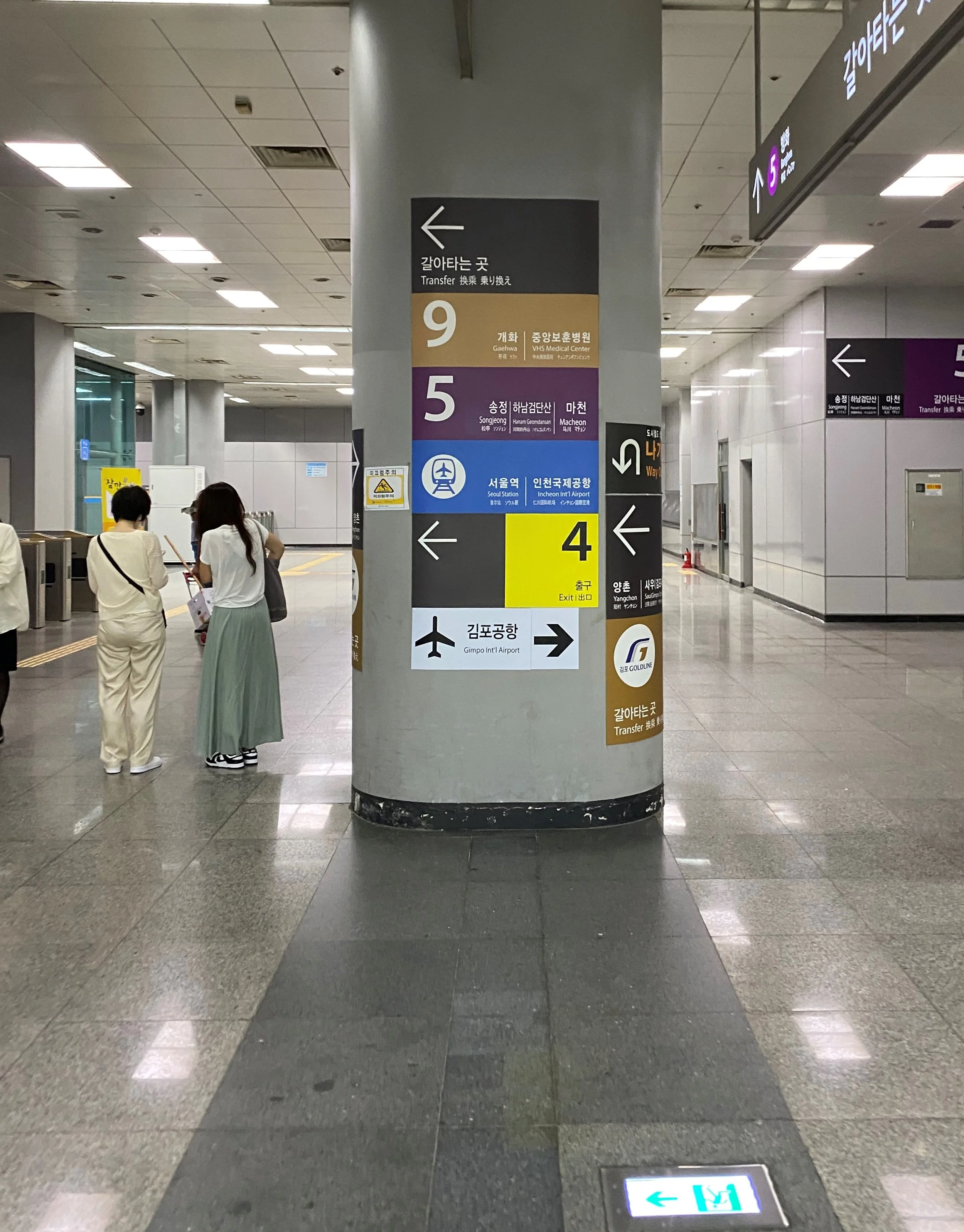
Clear: Wayfinding always needs to be discernible. For visual elements, for example, appropriate font sizes and spacing, color contrast, and having a backlight to be seen in the darkness are crucial.
I appreciate venues that have clear and ubiquitous labels. It is visually pleasing and emotionally reassuring to know where you are exactly; it’s also helpful for communicating both in casual conversations and during emergencies. For example, in Seoul, South Korea, (and many other metro systems), it is common to meet someone near a numbered subway entry/exit. Having been to Seoul many times, I find this system convenient because it is intuitive. “Use Exit 6 at Gangnam Station and walk straight 100m. The building is on the right,” is clearer than “Make a right toward Street X southbound.” How would you immediately know which way is south when there are two exits on both sides of the road?
Numbering systems are less common in the United States, but they shouldn’t be! Numbering everything from exit/entry, train cars, train car doors, and even bathrooms could drastically improve the user experience in terms of convenience and circulation. Most of these changes are small and low-cost and could be implemented rapidly.
2. Context: Thoughtfully selected points of interest (POIs)
Selecting points of interest is challenging because many establishments come and go. This can create cost issues for materials that need to be reprinted. One workaround: selecting POIs that are almost constant, (such as public schools, municipal buildings, hospitals, amusement parks, and places of worship). These days, more signage takes the form of real-time digital displays, which simplifies many aspects of adding and replacing POIs.
3. Locations: Strategic spacing

A digital display arrivals board, wayfinding signage, and tactile strips in the Seoul Metro.
Wayfinding placement is critical. If you don’t encounter wayfinding immediately upon arrival, it causes confusion, which can lead to a pause in movement. This creates anxiety and congestion.
In addition to having wayfinding available at points of arrival, I like ensuring the next element is always discernable far ahead, bolstering a feeling of confidence that the user is heading in the right direction. By contrast, when wayfinding elements are too close together, they clutter up the space (and cost more); finding a pleasant balance is important.
Wayfinding is an often-overlooked lever for making our transportation systems and facilities work better. Perhaps this is unsurprising; like much good design, when it’s working well, you may not notice it at all. Yet, whether it is airports guiding customers from gates to ground transportation services, or transit systems leading travelers through transfers at multi-modal stations, wayfinding is an indispensable customer experience tool. It can help visitors navigate as easily as local residents, and support all users in feeling welcome to and confident navigating in a space. As operators look to bolster transportation equity, increase ridership, and improve the user experience, wayfinding should be a key consideration across all systems.